Redesign Series - Post 1 - The Dining Room
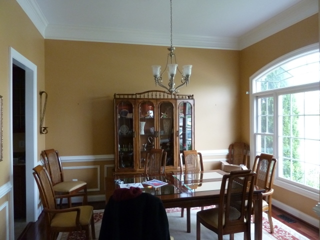
This will be the first post in a series of four posts showing the transformation of a house that wasn't working, on several levels, into a beautiful home that became more comfortable and a reflection of the homeowner's style.When my client contacted me it was in hopes of changing her home to something that didn't look like it was the combination of furnishings from two different households. That's what it was. When couples marry, they bring items from both his and her former homes and hope to make it work together. But it doesn't. They can't figure out why it's not working, but they know it doesn't.I had the opportunity to work with my client, a lovely lady, to transform her home. We started with the dining room. Below is a basic dining room. Overall a traditional style with heavy furniture and muted wall colors. They didn't have any window treatments and the chandelier was nice, but basic and hung a little too high. The area rug was dated and overall didn't have any style. So where do we start? Listening to the client! Determine the needs, wants and desires for the room and how it will fit into her lifestyle, design style, and how it needs to fit with the rest of the house. We discussed what furniture would be kept and what would leave. For this room, we kept the table and started over for all the other furnishings. Her style would be contemporary, and we needed a great piece of art as a starting point. It's always fun to learn interesting facts about your clients. In this case, they are tango dancers! So we selected a piece of art to complement their hobby as well as other pieces of art in their home.
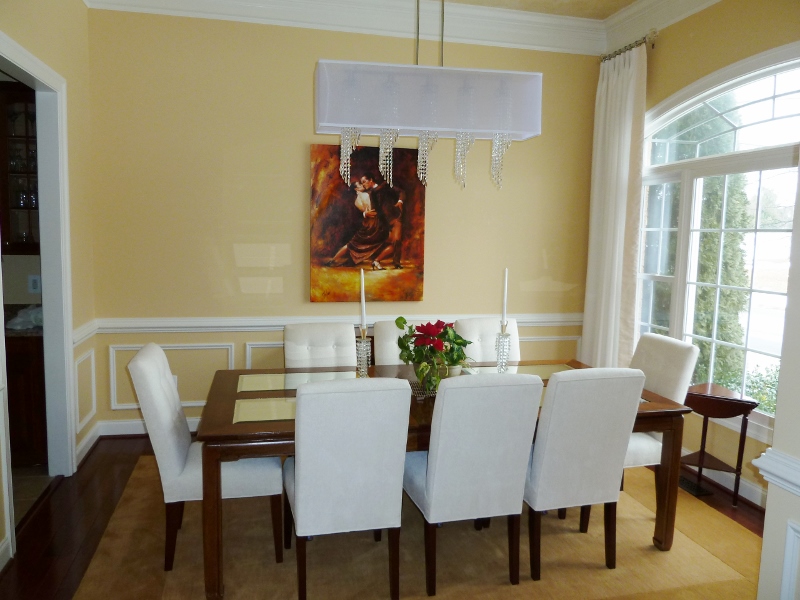
 The picture is a gallery wrapped canvas to go with the contemporary vibe. Next we selected the paint palette. We pulled a pale yellow from the picture. This immediatelly freshened up the space and made it feel lighter. We also had a faux painter create interest on the ceiling. The table has mirror panels, so there would be something interesting reflected. This also provided instant definition of the crown molding which was lost when the ceiling and molding were both white.
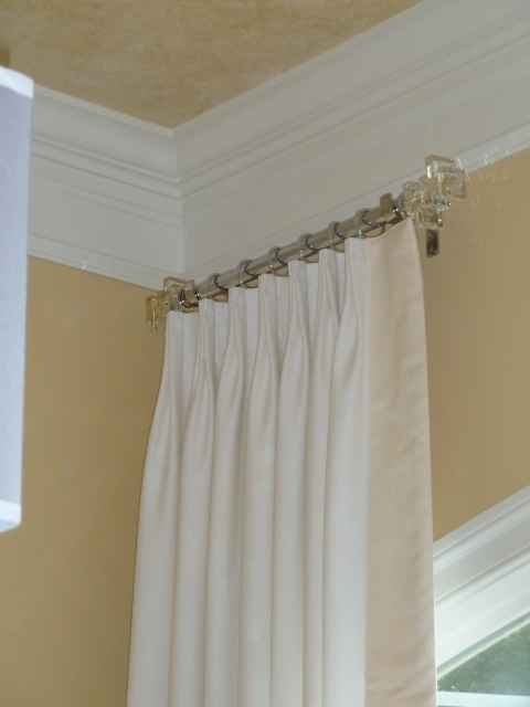
 After selecting the chandlier we decided to go with a crystal theme. Here you can see the beautiful stacked crystal finials on the chrome drapery rods. The drapery panels are a white linen with a metallic finish (just enought to give it a little sheen) with contrasting banding on the leading edge. Georgeous! And take a look at that chandelier...that says style and contemporary!
 Next we added the upholstered dining chairs. Linen with tufted backs, very comfortable for those lingering dinner parties. The chandelier has a silk shade and crystal spirals. The rectangular shape fits beautifully in the room.
 The wool area rug complements the new style with clean lines and a fresh elegant look.
 |
 |
 The finished room was successfully transformed to reflect the more elegantly contemporary style of my client! It's brighter and more comfortable and provides a great dining experience for their guests. It was a pleasure to work with her on this redesign!Happy Decorating!
 703-909-9013Cheryl@InteriorEloquence.com
